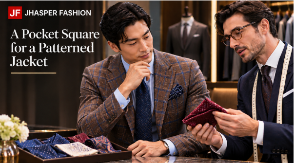
The jacket has a fine check, a faint colored line, and enough character to make a plain shirt look considered. Then you add a pocket square, and the outfit suddenly feels crowded. Start by borrowing one quiet color from the jacket, vary the scale of any added pattern, and adjust how much fabric shows. Judge the square as you will wear it, tucked into the pocket.
Find the Jacket’s Quietest Color
Study the cloth close enough to see its smaller details, then step back. A patterned jacket often contains colors that are easy to miss from across a room. A muted line within a check, or a lighter thread against a darker ground, can provide a connection for the pocket square without repeating the jacket’s most obvious feature.
Suppose a charcoal jacket has a restrained olive overcheck. A square with a small amount of muted green along its border could acknowledge that line while leaving the charcoal dominant. You do not have to find an exact thread match. Compare the pieces together and decide whether the relationship feels clear enough for the effect you want.
The quietest color is a starting point, not an instruction to make everything disappear. A pale edge against a dark jacket may draw more attention than a larger area of a deeper color. If you want the jacket’s pattern to remain the main feature, compare contrast as well as the names of the colors. Cream and dark brown can produce very different effects beside the same cloth.
Make the first comparison with a simple shirt and no competing accessories. This lets you judge the two fabrics together. Hold the square near the breast pocket rather than across the lapels. Its color will occupy a small area when worn, so judging an entire unfolded square can exaggerate its influence.
If no secondary color appeals to you, try a plain neutral. A square does not need to prove its relationship to the jacket through an obvious matching detail. You may prefer a gentle tonal connection or a more distinct contrast. Name the effect you enjoy before searching for an accessory that follows a rule you never particularly liked.
Vary Pattern Scale Instead of Matching Everything
Pattern scale means the size and spacing of a repeated design. A jacket with a broad windowpane and a square covered in tiny motifs creates a different relationship from two similarly sized grids. Varying scale is a useful experiment because it lets the patterns register differently. It is not a guarantee that any two patterns of different sizes will work together.
Consider a fine, busy check with a square carrying a large, loosely drawn botanical print. Once folded, the print may appear as a few areas of color rather than a second field of tiny detail. Reverse the idea with a broad, quiet check and a small repeated motif. In each case, test the section that will actually remain visible above the pocket.
Contrast can outweigh scale. A tiny, sharply defined black-and-white print may look more insistent than a larger design in closely related shades. If the combination feels restless, try a quieter version before assuming the pattern shape itself is the problem. You are changing the visual emphasis, not passing a test of whether checks and flowers belong together.
Matching every color can also make the decision harder than it needs to be. A square that repeats the jacket’s ground, overcheck, and accent line may feel more deliberate than you intended. Borrowing just one color leaves room for variation. A closely coordinated combination is also a valid preference.
For a tailoring discussion with Jhasper Fashion, bring the jacket and square together, or take the square when considering a jacket cloth. Its published process includes fabric and style consultation. Ask whether the small color connection you like will remain visible in the finished combination. This uses your own accessory as a reference without assuming the shop sells pocket squares or offers a separate styling package.
A phone photograph can help you remember which combination you preferred, but compare the real fabrics before relying on it. Screen settings and lighting can shift the apparent colors. Note the connection you liked so the decision does not depend entirely on an image.
Adjust the Fold and the Amount on Show
The fold edits the pattern. A straight fold can reveal a narrow border while concealing most of the print; a loose puff may expose a softer field of color from the center. Turn the square and try another section before rejecting it. One accessory may offer several distinct impressions depending on which part faces outward.
Put it in the actual jacket pocket. A folded square on a table says little about the bulk it creates against the chest. If the pocket bulges, simplify the fold or try a lighter or smaller square. Avoid pushing more material inside merely to reduce the visible height. The portion hidden in the pocket still affects how the jacket looks.
Begin with a modest amount showing and increase it gradually. There is no required measurement that suits every pocket, fold, or pattern. A small pale point may be enough against a vivid check; a muted puff may tolerate more height. Look at the jacket from a few steps away and notice whether your eye goes where you intended.
Then put back any tie or other accessory you plan to wear. If the chest area becomes busy, change one element and look again. The square may need a quieter fold rather than a different color. You can also leave the pocket empty when the jacket already provides all the detail you want.
Stop when the connection feels easy to read. The olive line does not need an olive tie, another green accent, and a precisely matched print to explain it. A small echo at the pocket can be enough. With the jacket on, the pattern should feel like something you chose to enjoy, and the square like a detail you can leave alone once you step away from the mirror.
Read more: The Growing Appeal of Timeless Clothing Over Fast Fashion

Jhon AJS, the creative mind behind Grammar Update, is an experienced blogger passionate about simplifying English grammar. He focuses on explaining confusing word vs word differences, grammar rules, punctuation, and sentence structure in a clear and practical way. Through easy to understand guides and examples, Jhon helps readers improve their writing and communicate with confidence. With years of blogging experience, he continues to share helpful insights that make learning grammar simple, useful, and accessible for everyone.